Our Projects
Campaign Illustration | Year 3 | University Project
Bumble For Friends
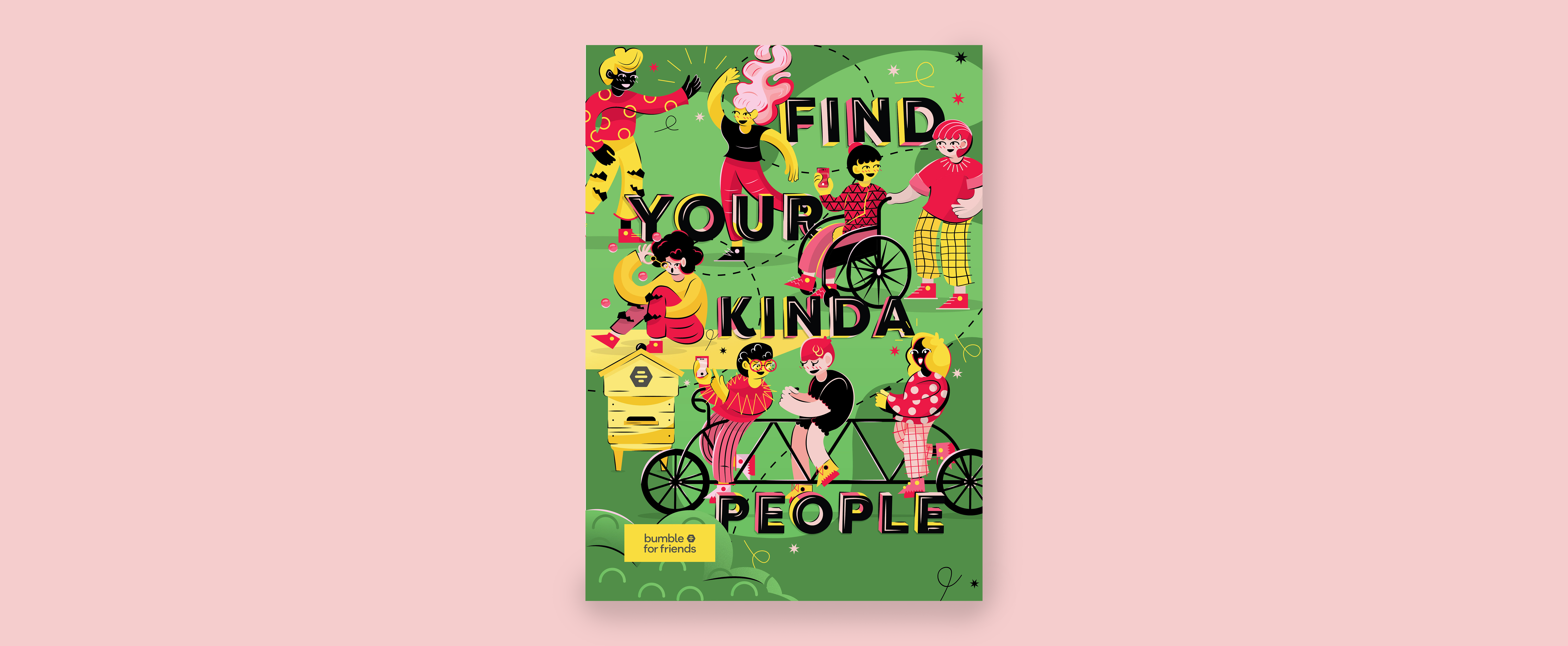
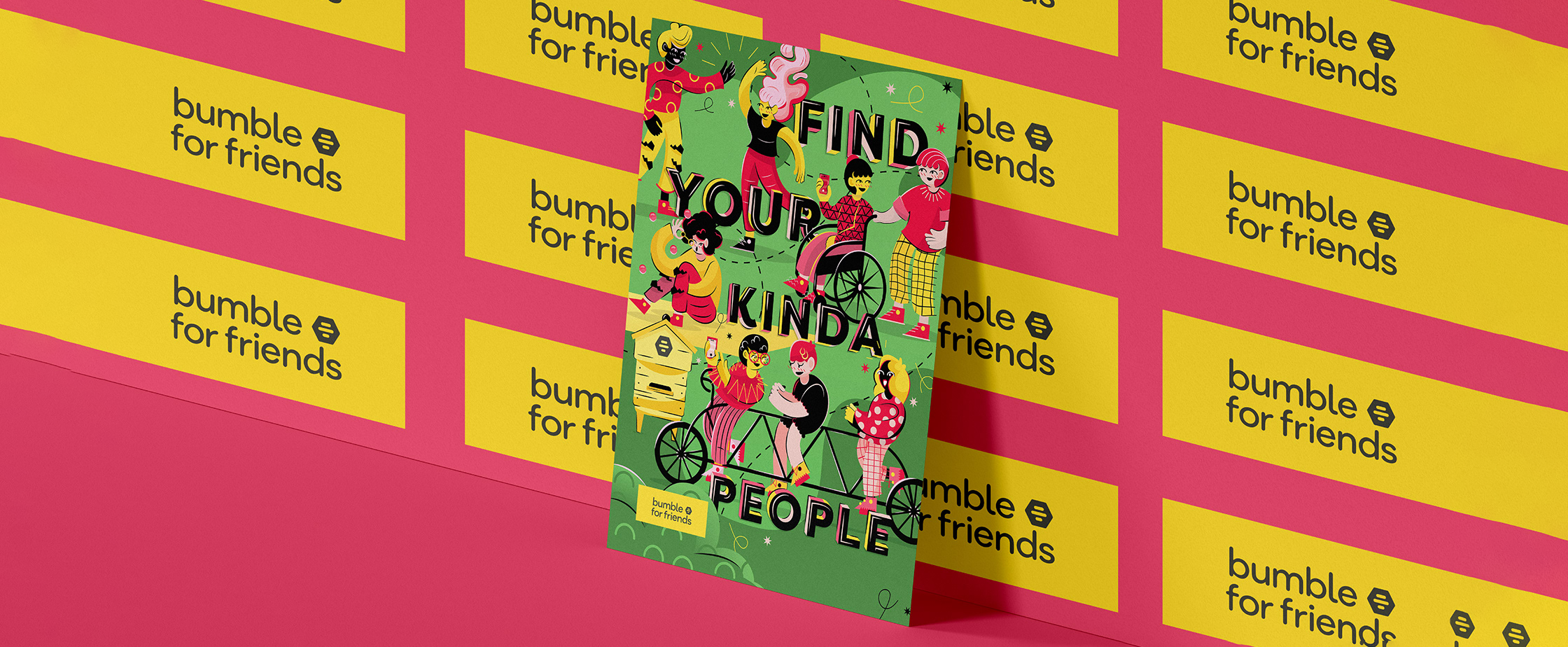
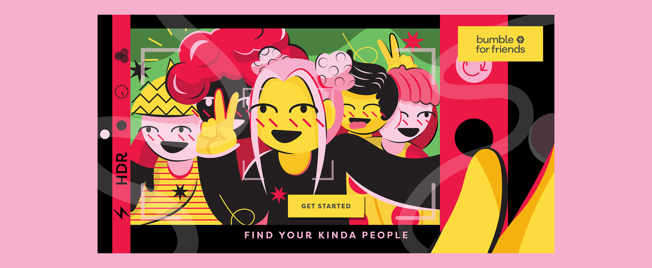
For this project, I developed an illustrated social media campaign for Bumble For Friends, focusing on creating engaging visuals that foster connection through friendship. The brief required content tailored for social media advertising, as well as the design of an A3 poster, all executed exclusively in Adobe Illustrator. The campaign tagline, “Find Your Kinda People,” captures the idea of discovering a sense of belonging and building meaningful social circles through the app. My visual approach reflected Bumble’s friendly and inclusive tone, using illustration to create a warm, approachable aesthetic that resonates with its audience. A key focus of the project was adaptability. I structured my working files to be clean, organised, and easily editable, ensuring the designs could be efficiently updated or expanded across different formats. This approach supported both consistency and collaboration, aligning the campaign across digital and print deliverables while maintaining a cohesive brand identity.
View Project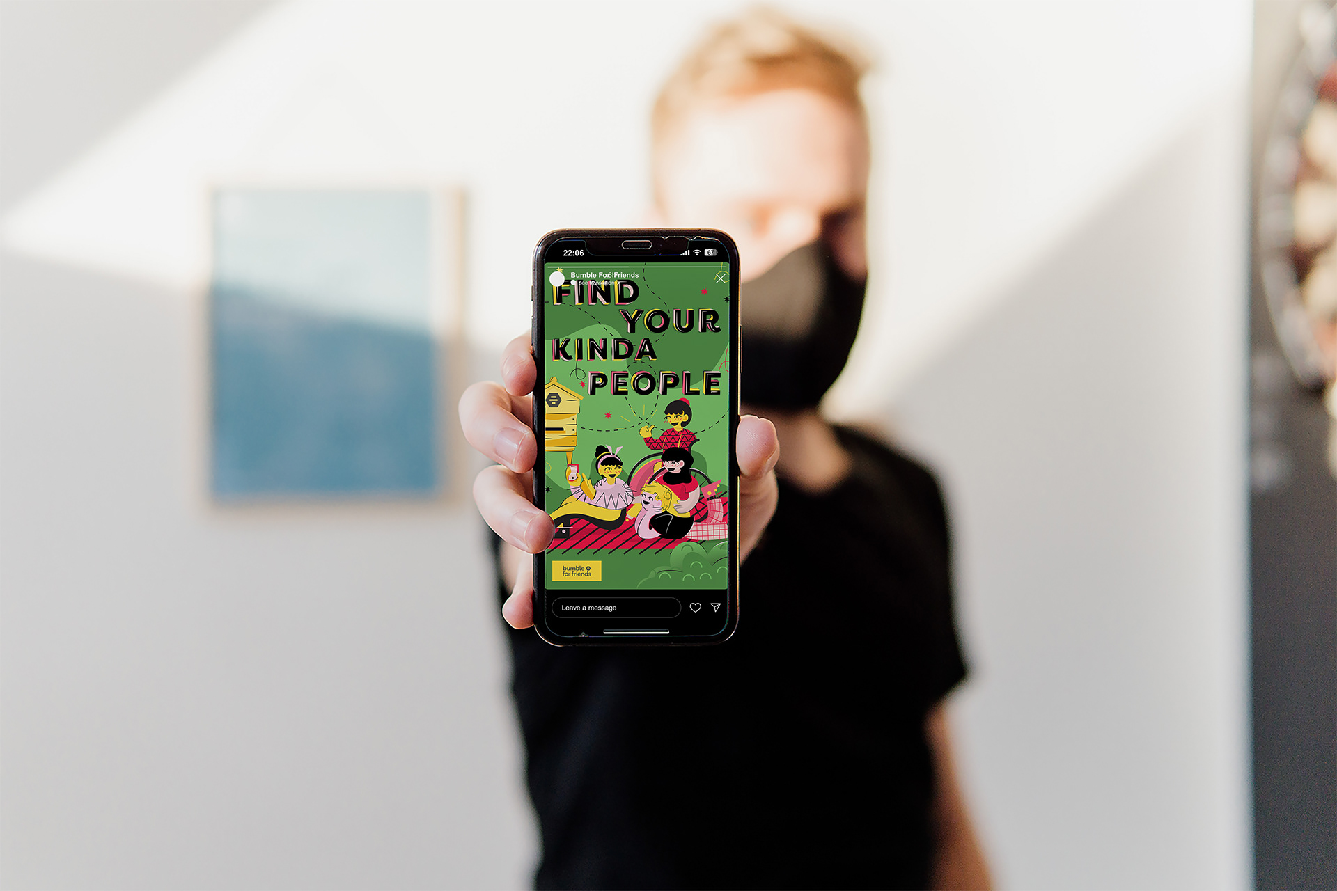
Open Window Project | Year 3
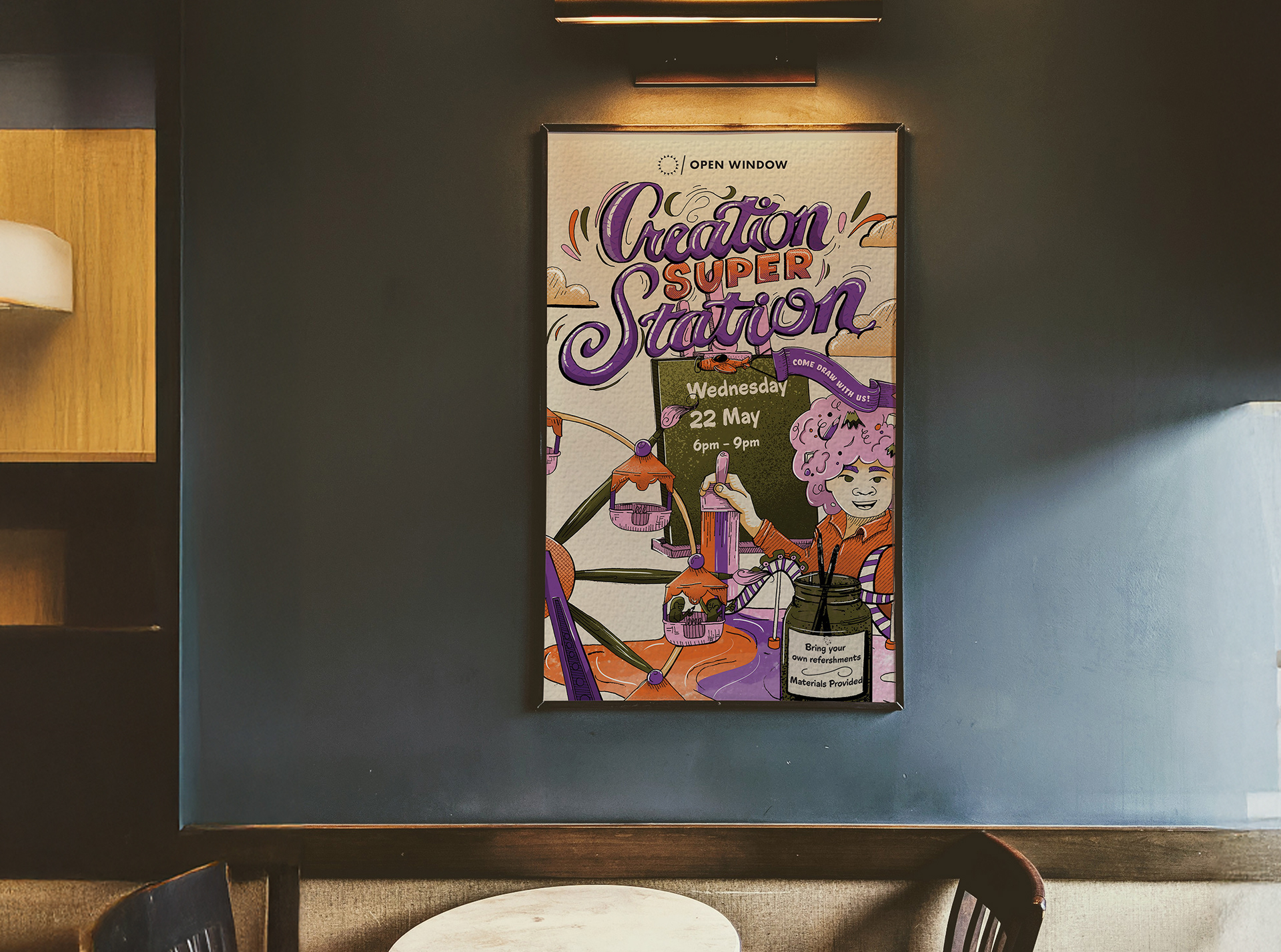
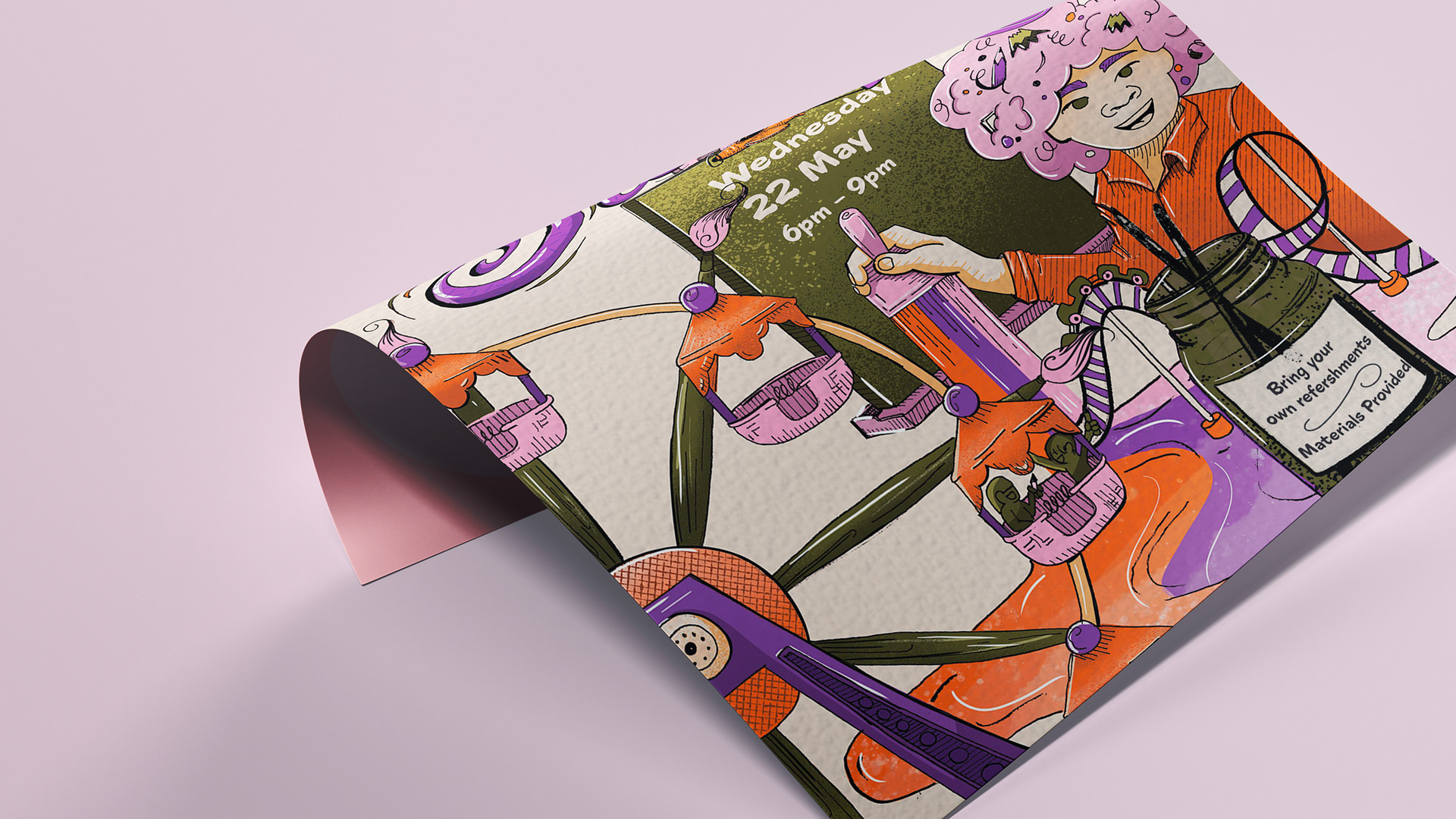
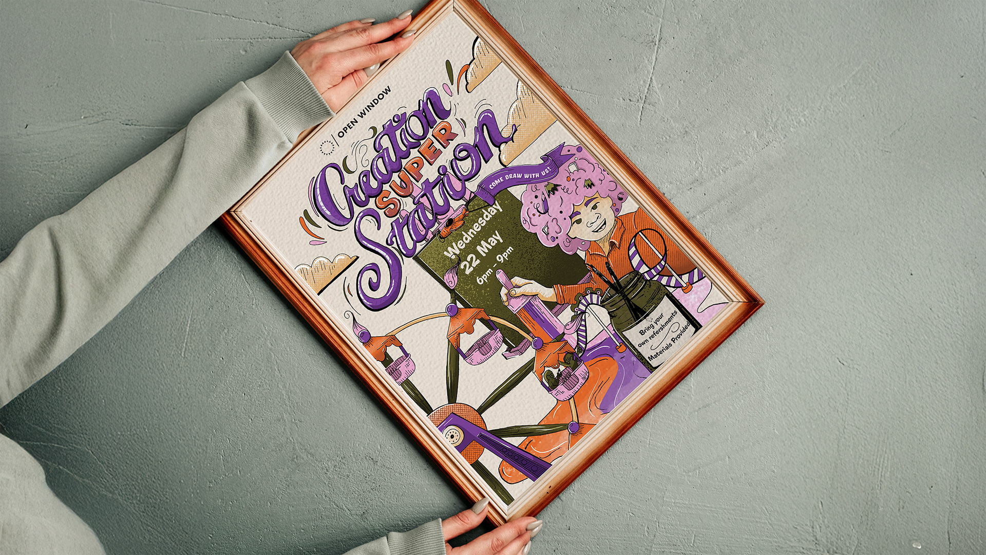
Creation Super Station
For this project, I wanted to explore how traditional drawing techniques could be integrated into a final digital design. The brief required the creation of a marketable poster for an Open Window event centered around artists connecting and drawing together. At the time, I was studying Mikhail Bakhtin’s theory of the carnivalesque, which celebrates liberation, equality, and playful chaos through humour, masquerade, and the subversion of social hierarchies. I contrasted this idea with a common challenge among artists, burnout. My concept imagined the event as a space of creative renewal, where Bakhtin’s carnivalesque spirit could help dissolve pressure and reignite imagination through collective creation. The development of this piece involved an extensive sketching process, with careful consideration given to composition and the placement of event information. Because the poster needed to remain both expressive and functional, I focused on balancing detailed illustration with clear, readable layout. The artwork itself was hand-drawn, then scanned and refined digitally in Photoshop, where I added colour and final details. This project strengthened my drawing ability and improved my approach to composition and planning. It also deepened my understanding of how to embed conceptual meaning into a design while maintaining a strong sense of invitation and accessibility.
View Project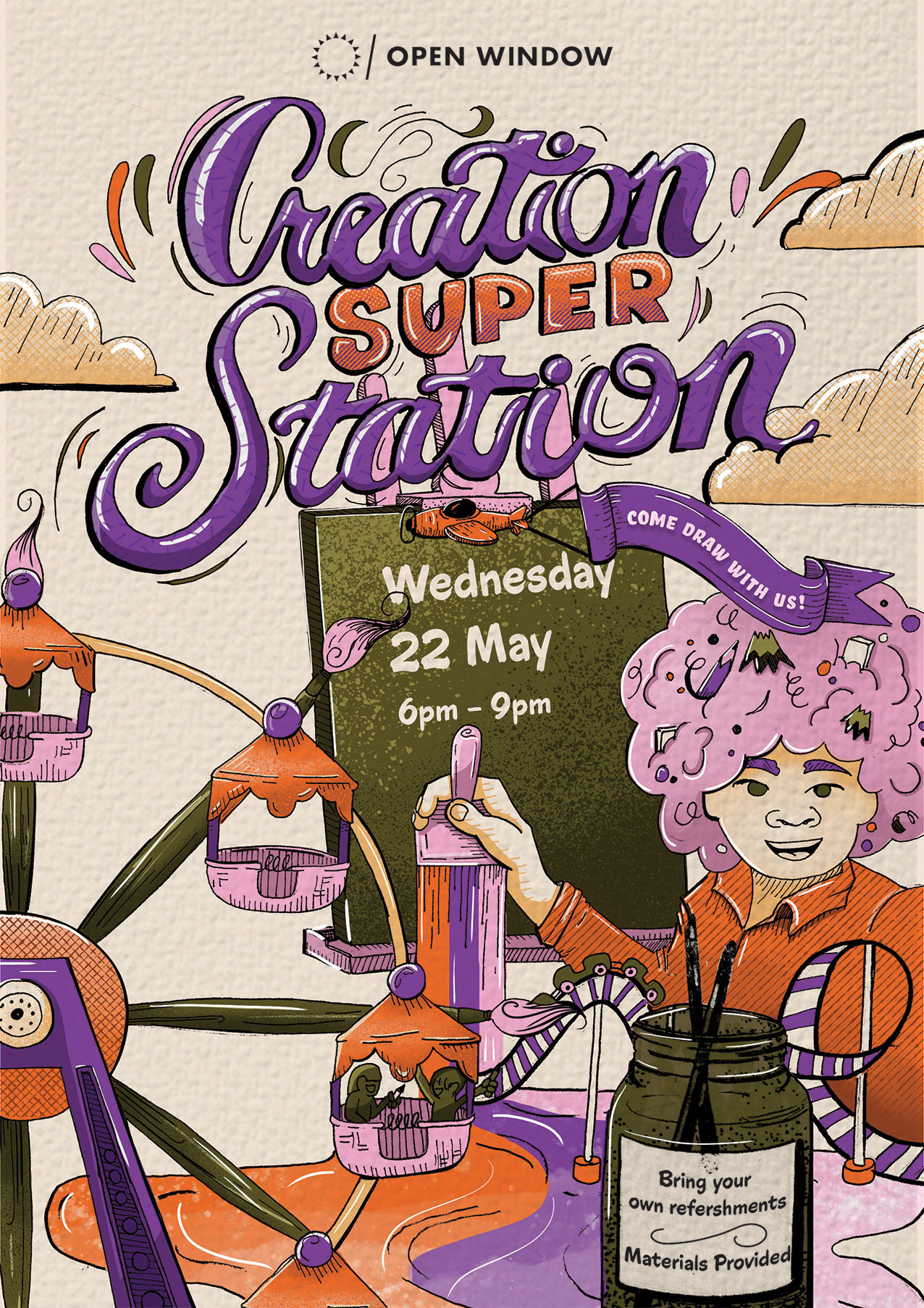
Motherland Coffee Campaign | Year 3 | University Project
Motherland Coffee
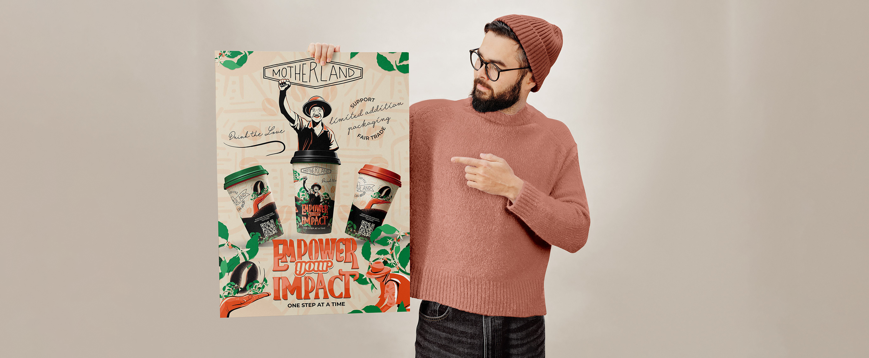
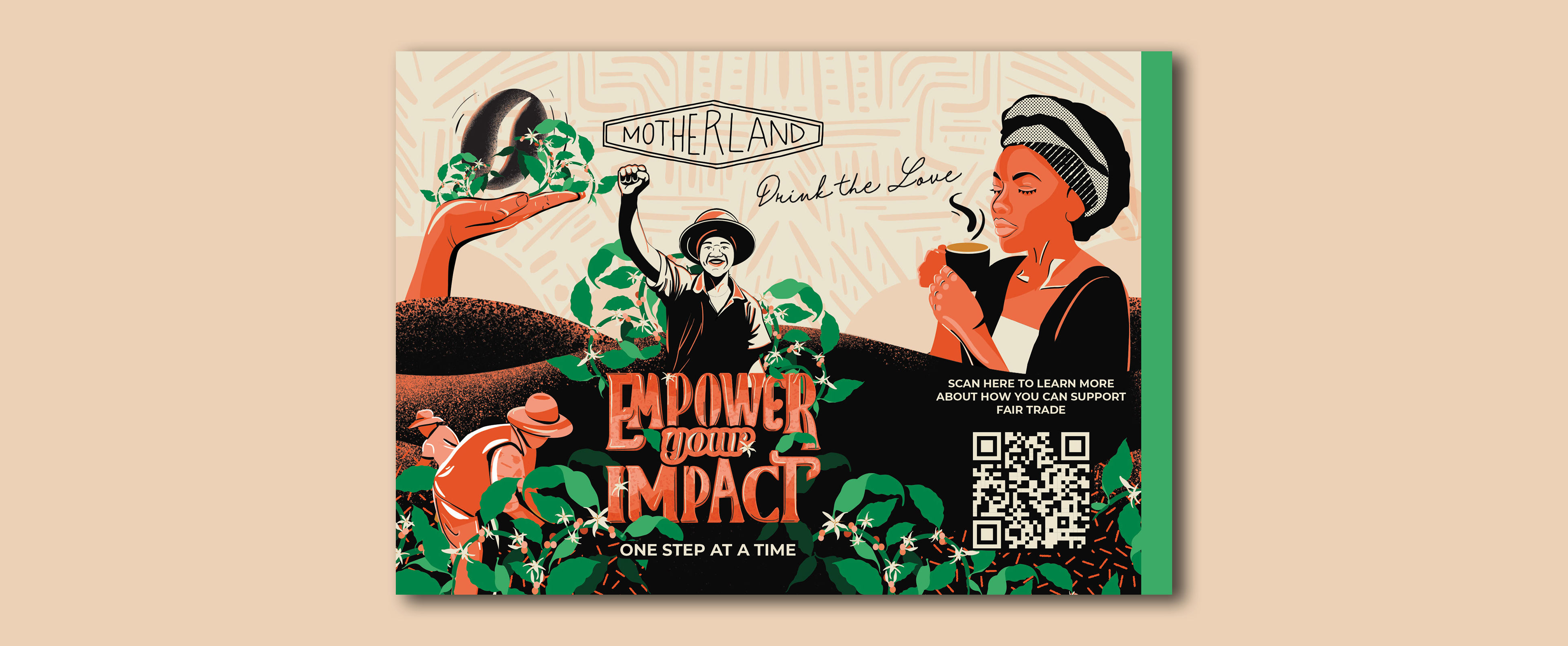
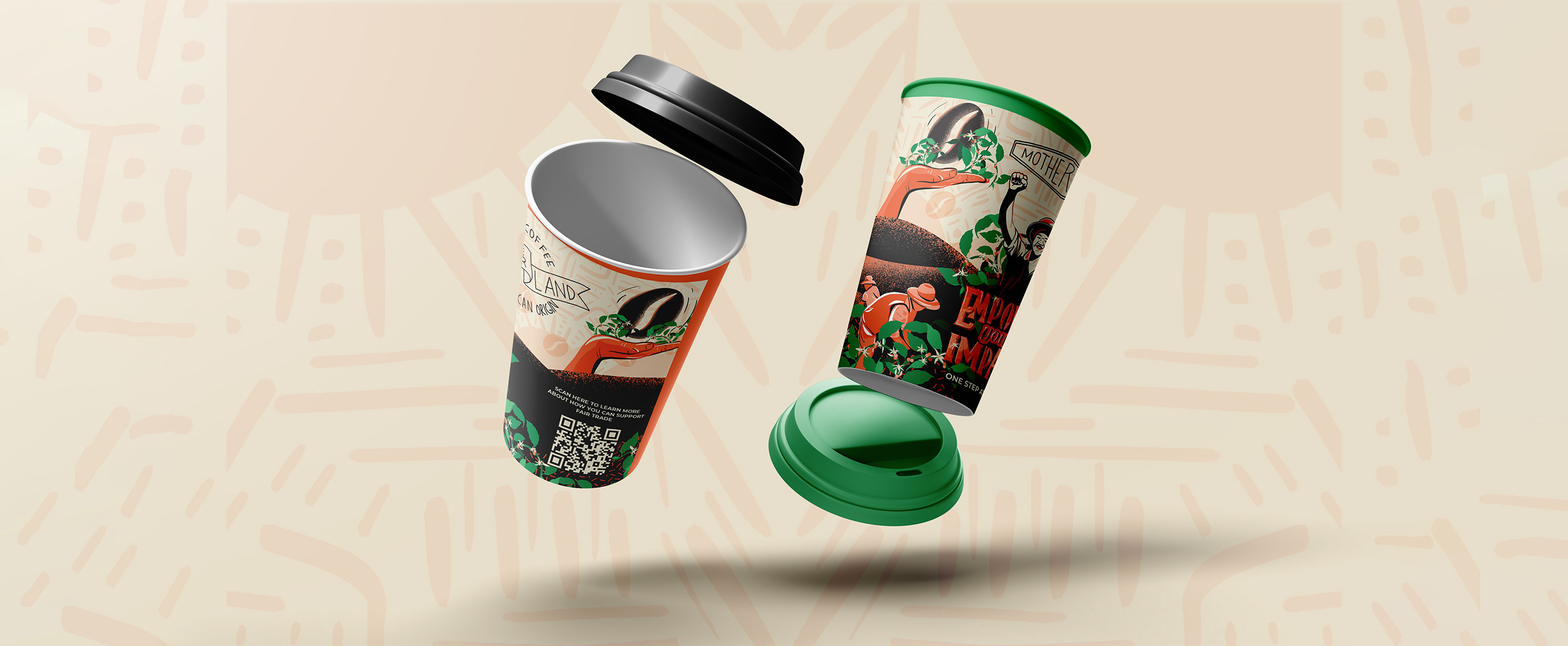
For a school project, I was assigned to create an illustrative campaign for Motherland Coffee Co., a South African coffee brand known for its commitment to fair trade. My task was to design a campaign that highlights the brand's mission to support ethical sourcing and sustainable practices. I developed a unique tagline that reflects this ethos, crafting visuals that resonate with Motherland’s values and appeal to a socially conscious audience. This project allowed me to explore impactful design that aligns with a brand’s core principles, blending art and advocacy in a way that supports local farmers and promotes fair trade awareness. My campaign tagline, "Empower Your Impact," serves as a call to action, inviting consumers to recognize how their choices can positively impact the lives of others. Through research, I discovered that Motherland Coffee Co. sources its beans directly from Africa. Inspired by this connection, I incorporated coffee bean farmers into the visuals, creating a bridge between consumers and the hands that cultivate each cup. The flourishing vines in the design symbolize a shared, prosperous future for both workers and consumers, weaving African influence into the illustration for a culturally resonant and relatable aesthetic. To maintain visual harmony, I adhered to a four-color palette, ensuring the illustration remains bold yet balanced despite the color limitations. This project allowed me to merge impactful messaging with Motherland’s values, designing a campaign that speaks to both ethical sourcing and consumer responsibility.
View Project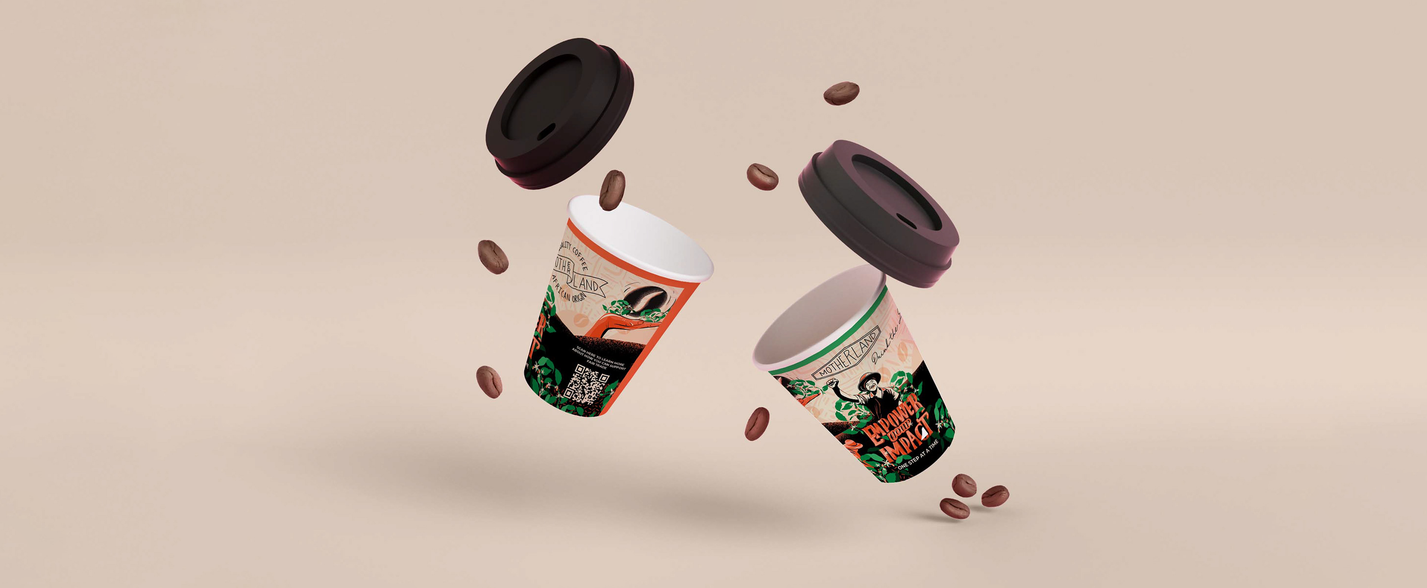
New Yorker Magazine Cover | Year 3 | University Project
New Yorker
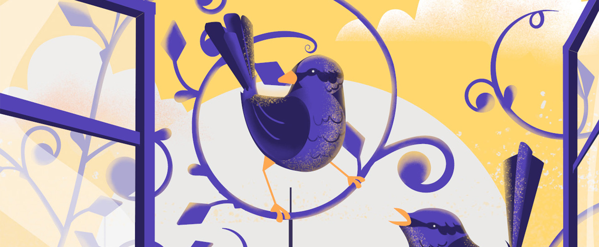
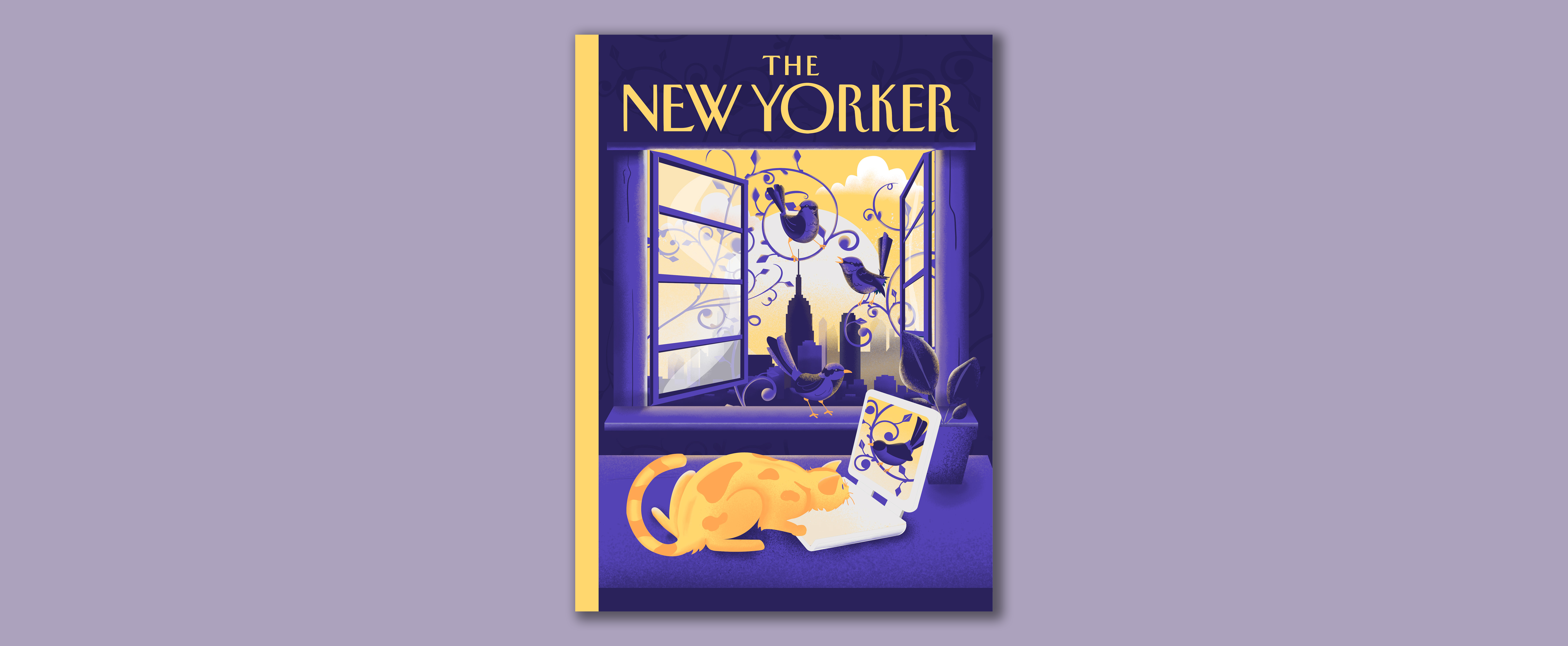
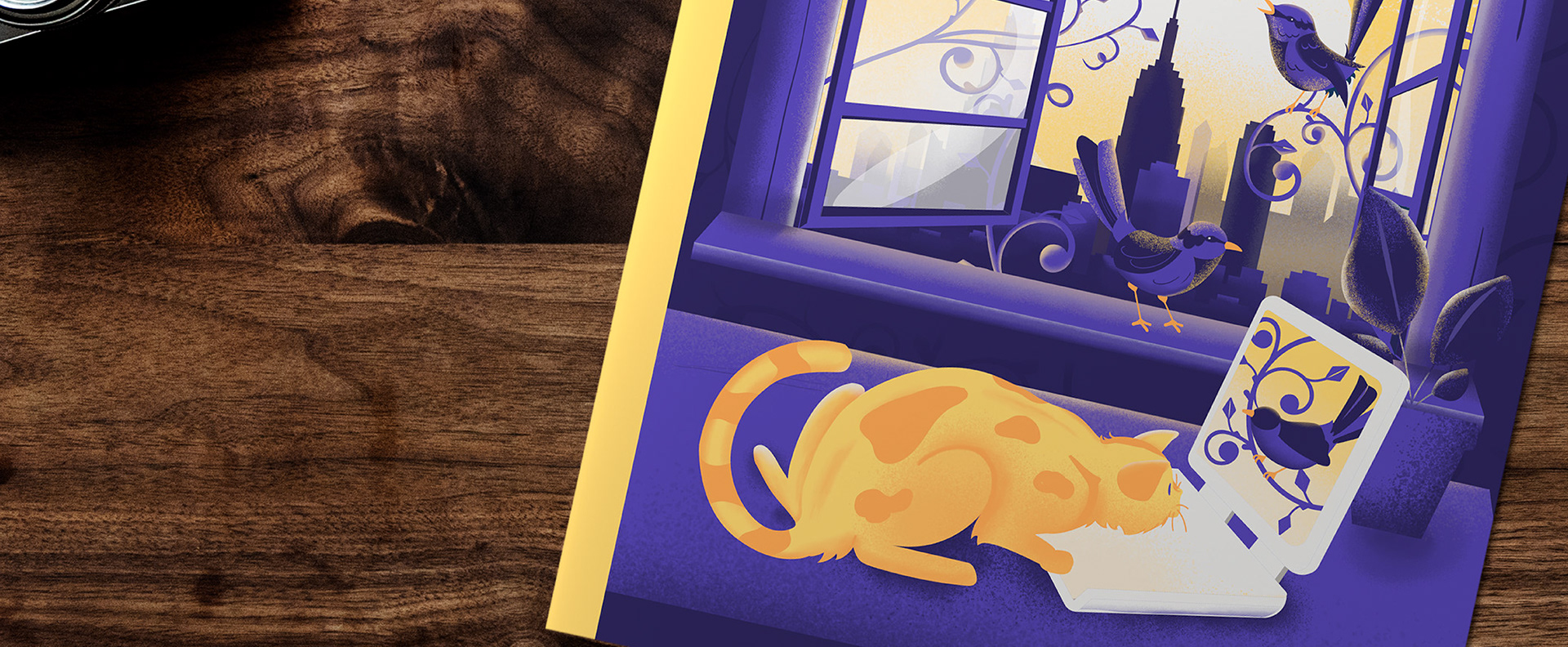
For my third-year Illustration project, I was assigned to create a magazine cover for The New Yorker, focusing on the use of a visual metaphor. Visual metaphors employ imagery to represent abstract concepts, enabling viewers to grasp complex ideas through relatable symbols. This assignment challenged me to distill my concept into a single, impactful image that would resonate with The New Yorker’s audience while maintaining the subtlety and sophistication typical of the publication’s style. The result is a cover that invites viewers to uncover layers of meaning through metaphor, blending artistry with insightful commentary. The magazine cover serves as a visual metaphor for Jenny Odell's article, "Can We Slow Down Time in the Age of TikTok?" In the article, Odell encourages readers, particularly students, to rethink their relationship with time by engaging in activities that foster deep focus and creativity. Inspired by this, I envisioned a cat fixated on a computer screen, its gaze intense and unbroken. Behind it, an open window reveals birds in flight _ symbols of freedom and potential experiences waiting outside the digital world. This contrast highlights how social media can confine our attention, holding us back from a fuller, more present life.
View Project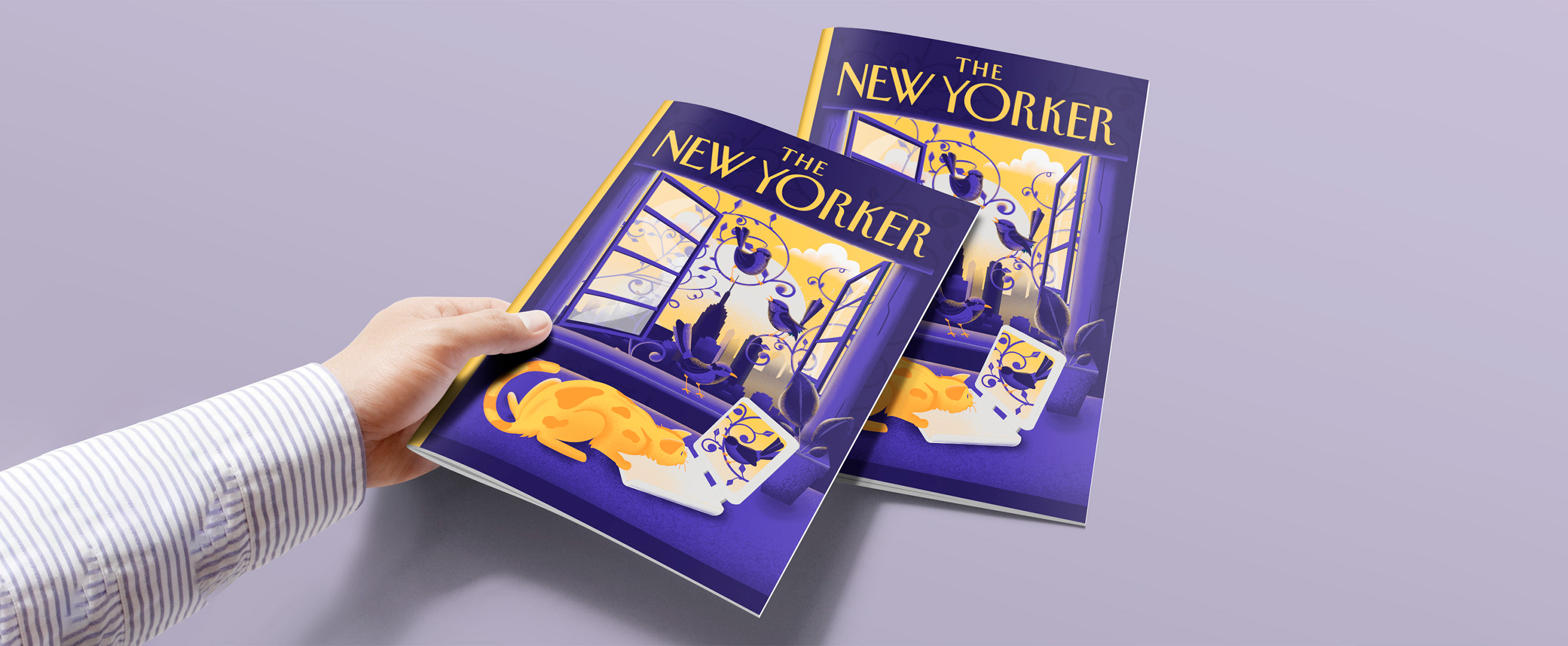
Vegan Paws | Year 2 | University Project
Vegan Paws
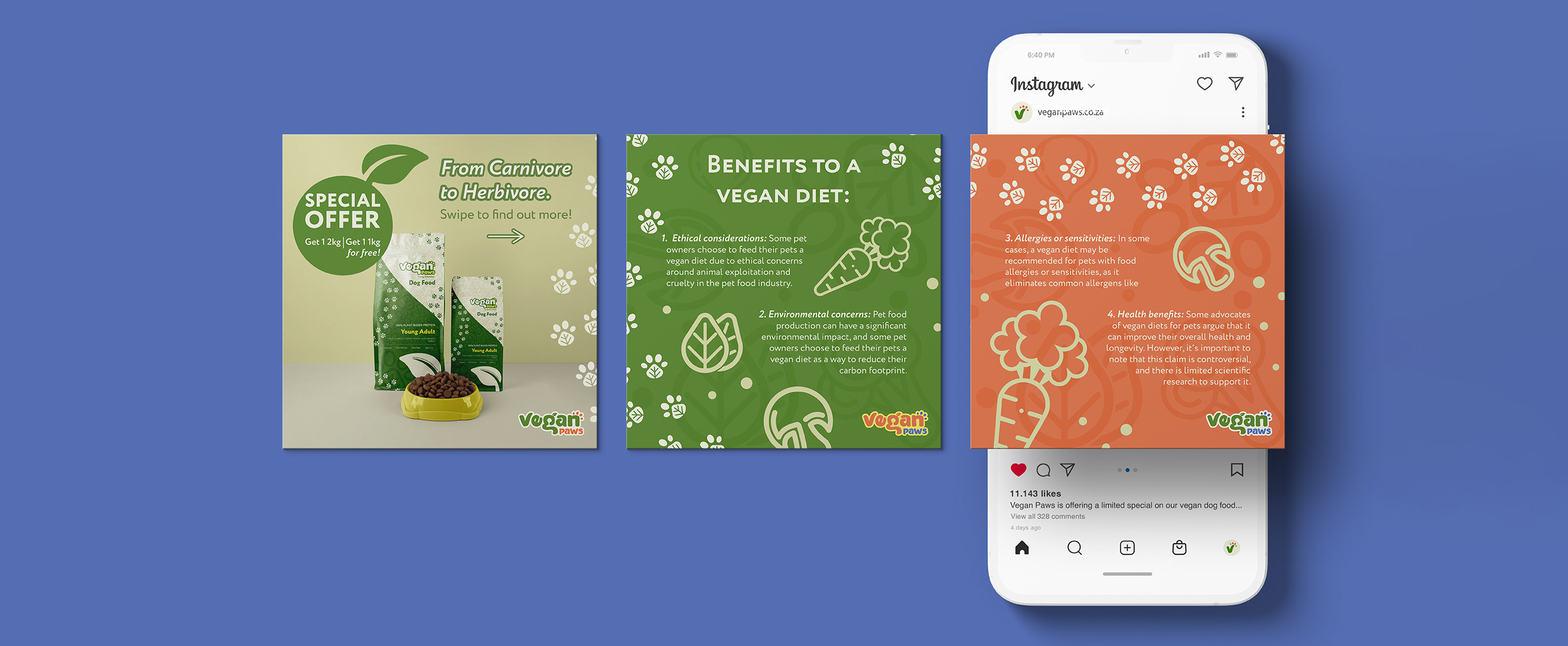
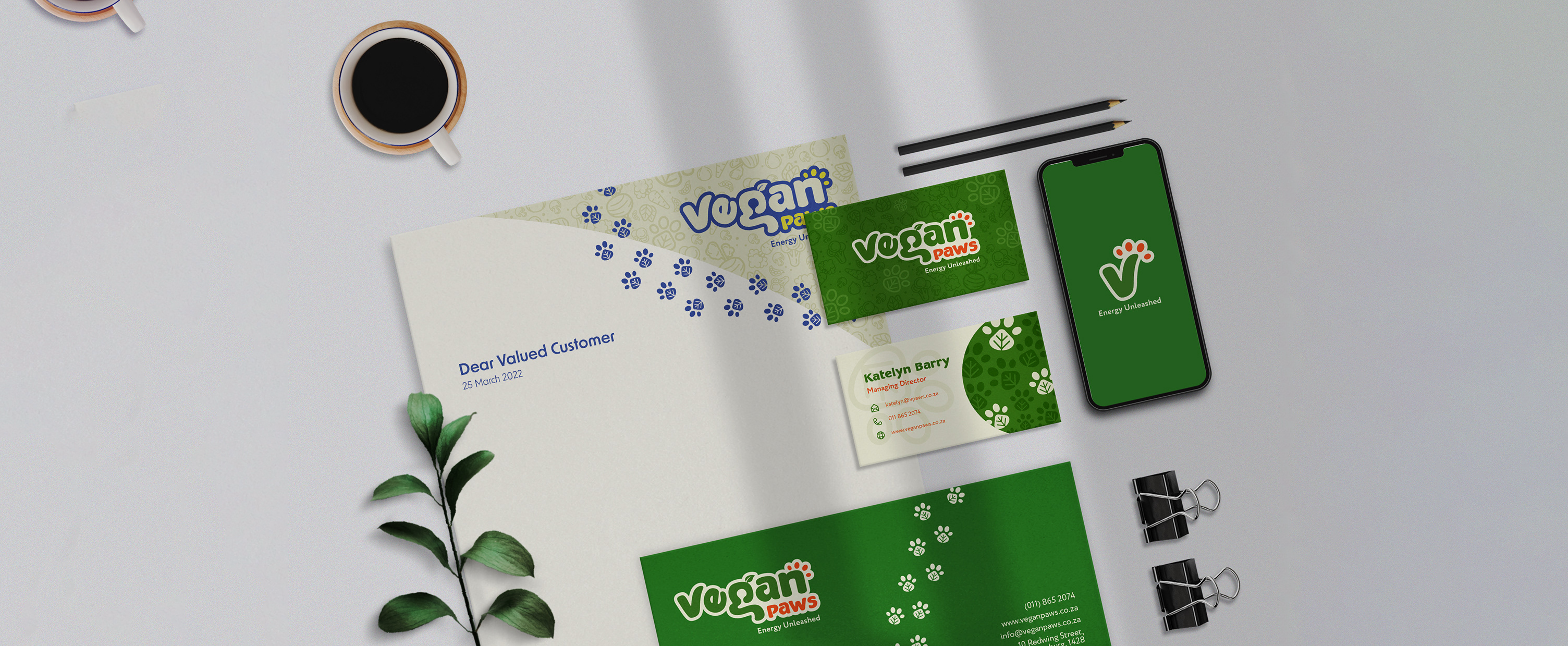
For this Communication Design project, I was tasked with creating a unique brand identity for a self-conceptualized business. Drawing from my personal values - such as my commitment to animal welfare and veganism - I developed a business concept focused on animal products that are entirely eco-friendly and vegan. This project allowed me to blend my passion for sustainability with thoughtful design, resulting in a brand identity that reflects both ethical principles and a love for animals. During my research, I identified a common misconception about vegan protein, particularly regarding its effectiveness and benefits for pets. This insight helped shape the mission of the brand, which is captured in the tagline “Energy Unleashed.” Much like the boundless enthusiasm of a dog being let loose to play, Vegan Paws embodies an energetic and vibrant spirit, dedicated to optimizing pet health while promoting sustainable choices. The brand’s visual identity evolved to reflect this mission through playful, dynamic imagery, symbolizing the unleashed potential of pets when nourished by healthy, eco-conscious, plant-based products. In researching the target audience, it became evident that Vegan Paws appeals to a progressive, youthful demographic - people who embrace new trends and ideas. To connect with this forward-thinking audience, I focused on creating memorable icons and distinct lettering that would visually communicate the brand’s mission and values. Every design element was crafted to be both recognizable and meaningful, ensuring the brand identity resonates with young, conscious consumers who prioritize both their pets’ health and sustainable choices.
View Project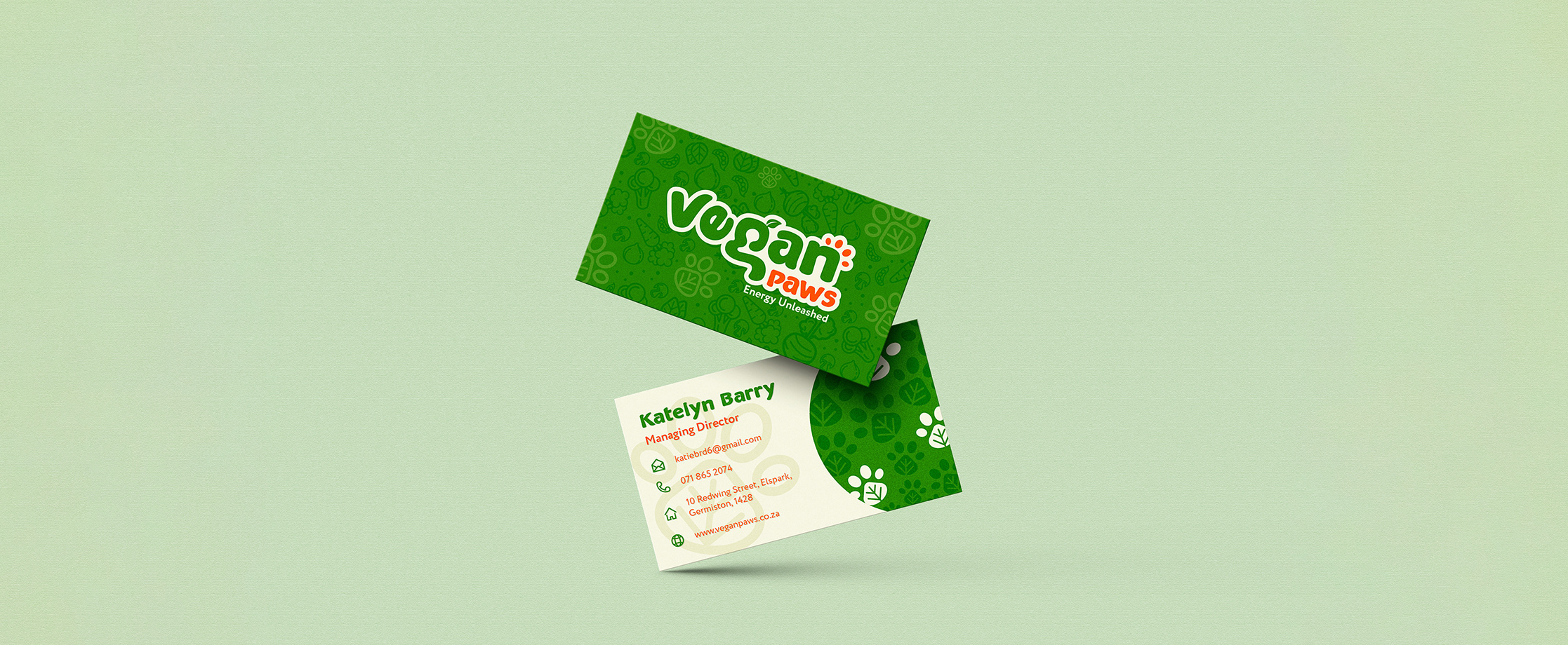
Brand Rejuvenation | 2026
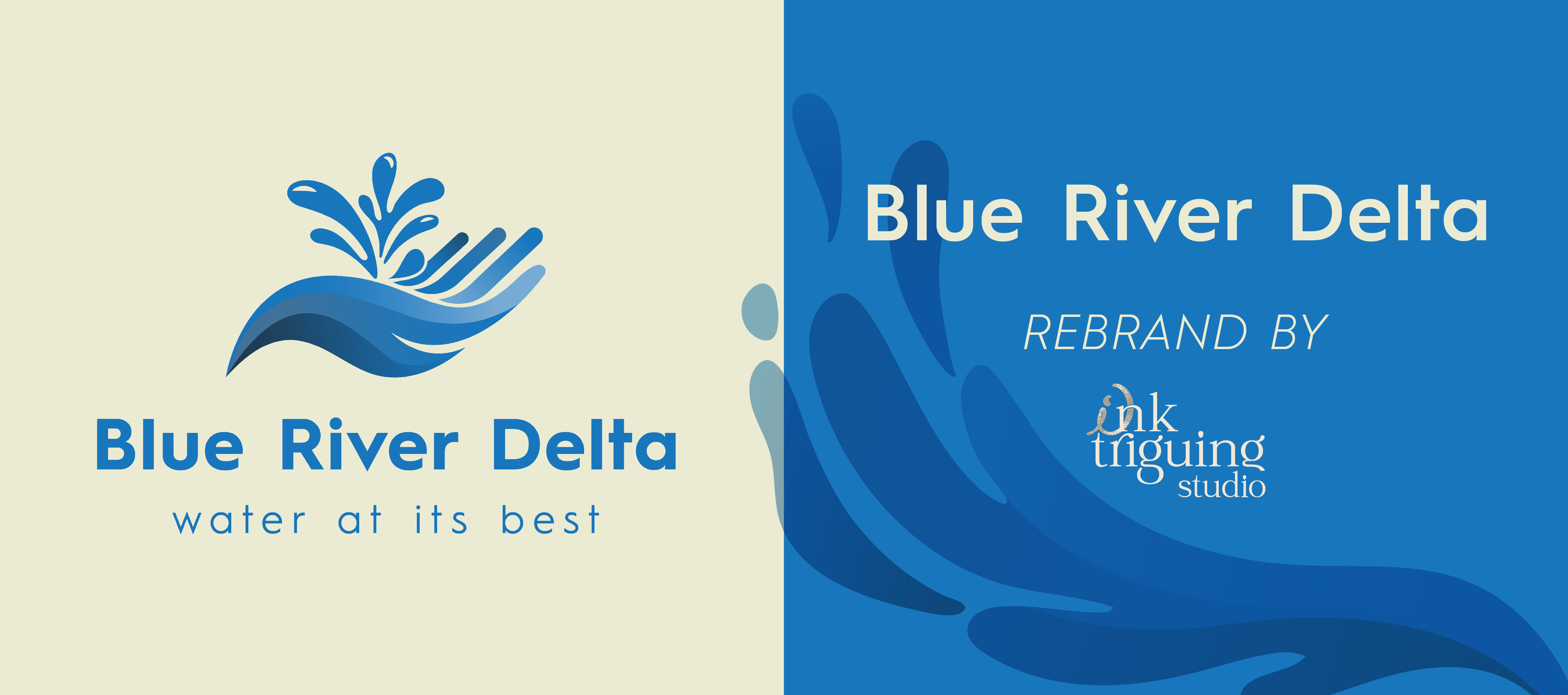
Blue River Delta
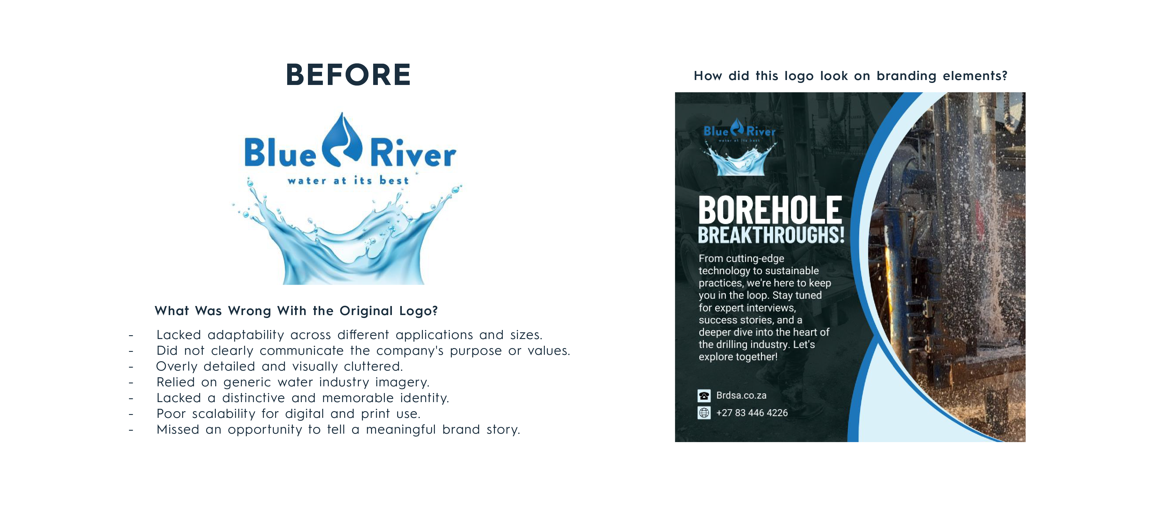
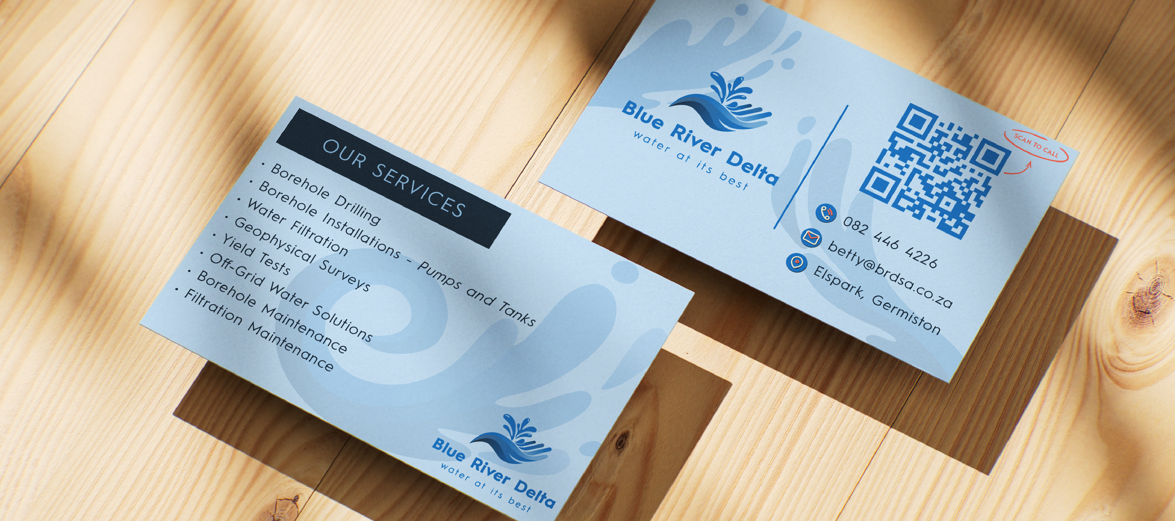
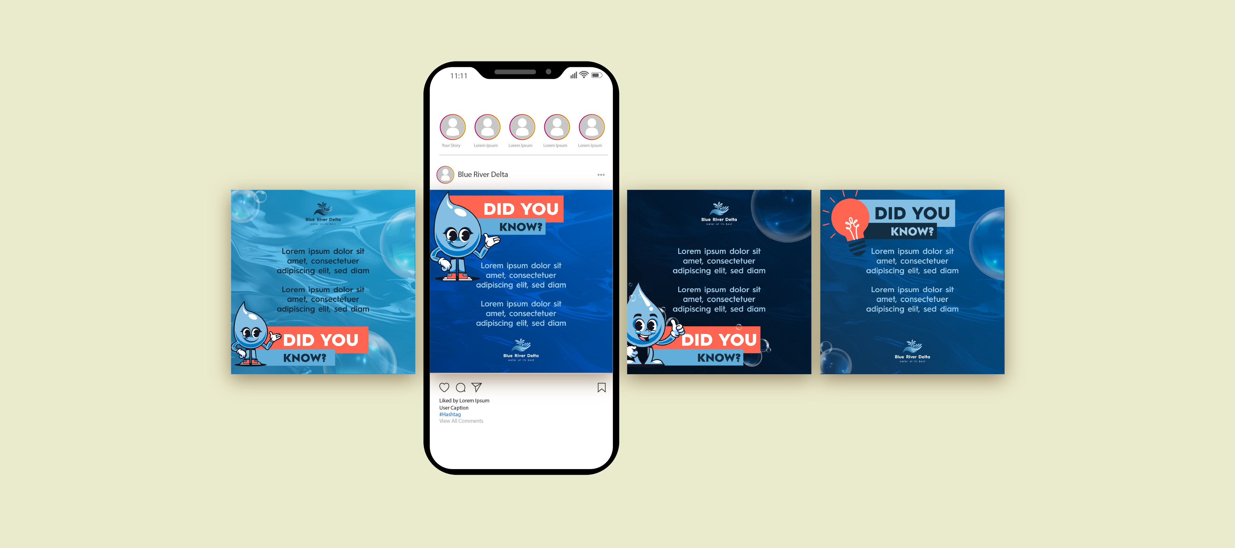
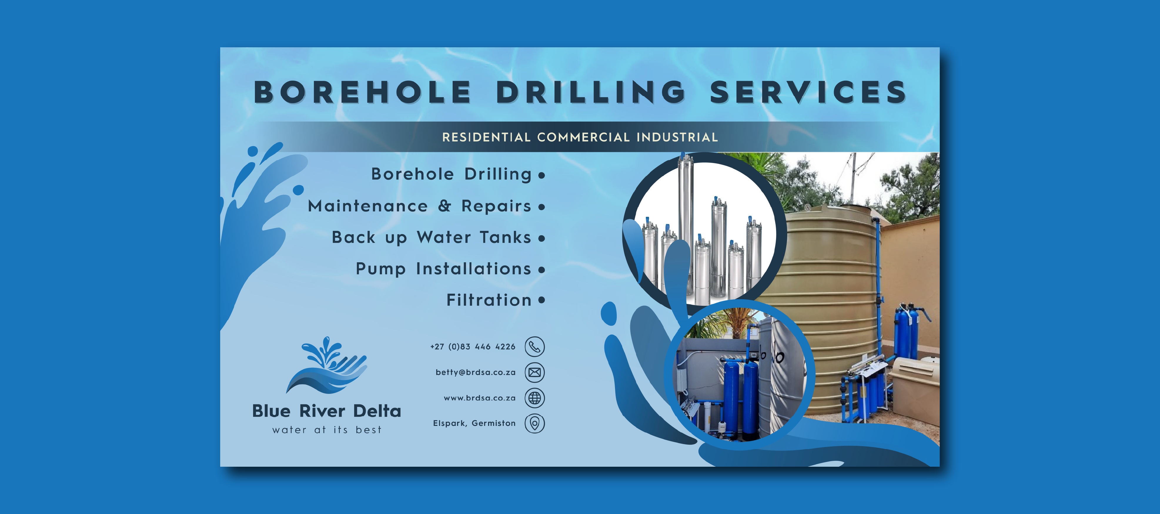
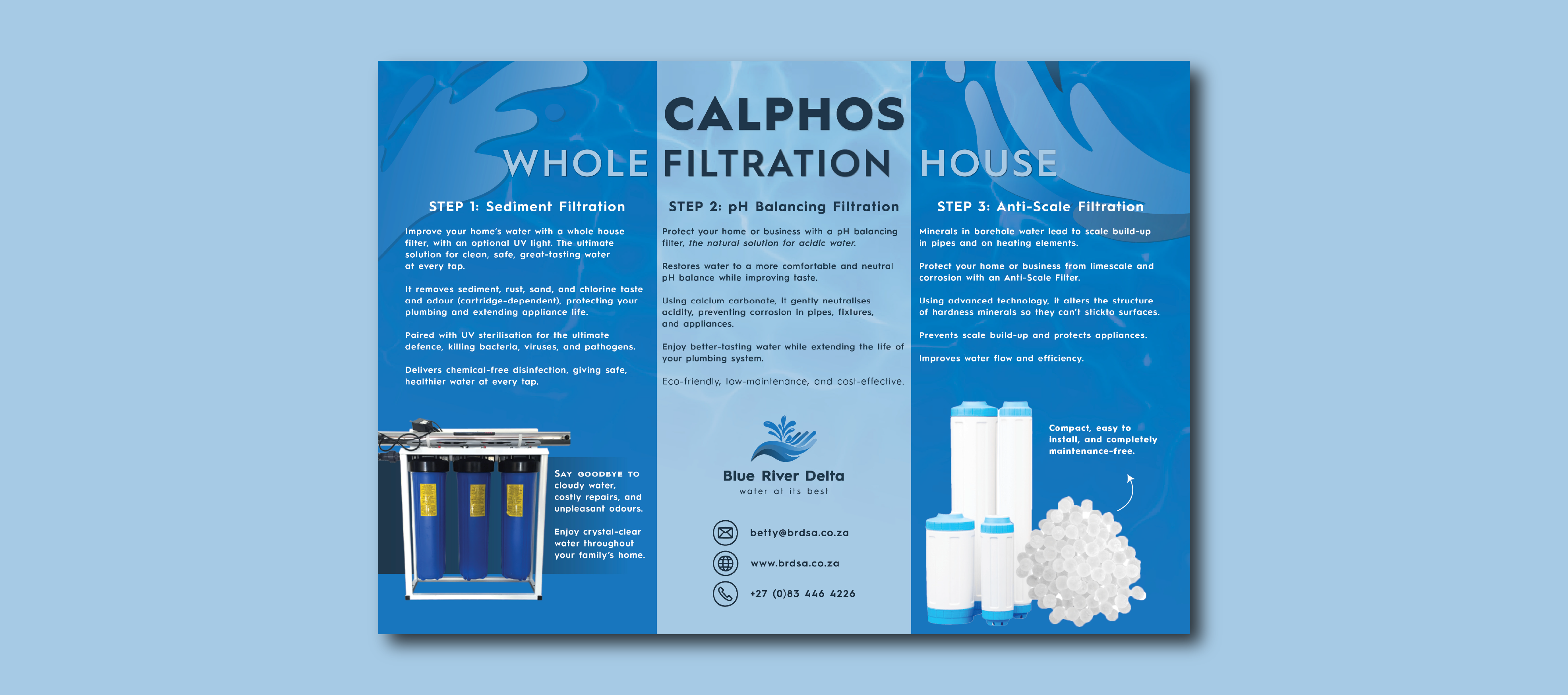
Blue River Delta is a borehole drilling company with over 25 years of industry experience. I was commissioned to develop a complete brand refresh that could be consistently applied across all customer touchpoints, including the website, social media platforms, email signatures, and marketing materials. The client wanted the brand to communicate a strong sense of community, sustainability, and giving back. They felt that their existing logo lacked flexibility and failed to reflect the company's values and long-standing reputation within the industry. The rebrand focused on creating a distinctive and adaptable visual identity, with particular attention given to the logo icon. The goal was to develop a mark that could remain effective across various sizes, applications, and colour variations while standing apart within the borehole drilling sector. Through research and close collaboration with the client, the concept of water as a source of life became the foundation of the brand. The visual identity was built around the idea of water nourishing communities, supporting growth, and creating lasting impact. Every creative element was developed with intention, ensuring the brand conveyed a clear message, strong personality, and meaningful connection to the company's purpose.
View Project